


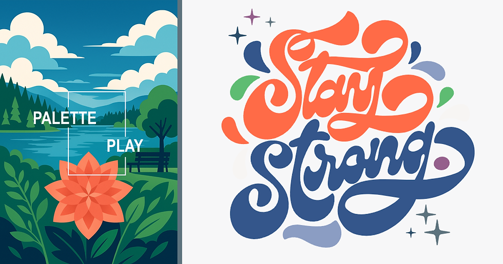
Palette Play
- Stephanie Dyke
- Aug 17, 2025
- 4 min read

Updated: Aug 22, 2025
Most color palette advice starts with color wheels and competitor analysis. But sometimes the best palettes come from somewhere more personal and intuitive. Let me show you how my palette actually came together, then we'll dive into the technical stuff.
Early 2020: I painted my office Pantone's Color of the Year, Classic Blue (Pantone 19-4052 for all you color nerds out there). I was obsessed with this dynamic blue that changes with the light.
Plot twist: I spent the next few years stuck in that office. Classic Blue became my Zoom backdrop for hundreds of meetings during the pandemic.
Fast forward: When I launched this business, I decided to lean into Classic Blue. The color was already part of my daily work life – why fight it? But as I developed my brand, it began to feel too corporate. I needed brightness to balance it out.
Enter Living Coral. After years in corporate offices, I was ready for bold, happy colors. Blue and Coral became my foundation, then I boldly added Mission Green and a few muted supporting hues.
My palette was born from obsession, tested by circumstance, and refined by instinct.
The Intuitive Approach
When it comes to choosing colors intuitively, you likely already know more than you think you do. You've probably decorated spaces. You know what colors make you feel energized versus calm, what combinations feel sophisticated versus playful.
Start with your color crush. What color makes you stop scrolling? What hue do you find yourself gravitating toward in clothes, home decor, or art?
Live with it. Put that color somewhere you'll see it regularly. Use it in a presentation. Make it your phone wallpaper. Paint a poster board (or, like in my case, go straight for a room). It's nice to know how it feels in different lights, at different times of day, when you're stressed versus energized.
Notice what feels off. After a few weeks, pay attention to your gut reaction. Does it feel too serious? Too loud? Too cold? Your instinct will tell you what needs to be balanced.
Add what calls to you. Don't just pick complementary colors because the color wheel says so. What color would make your first choice feel more complete? Trust the combination that makes you excited, not the one that makes logical sense.
Be bold with your third choice. Your first two colors establish the vibe. Your third color is where you can take a risk and show some personality.
Build your supporting cast. Every great palette needs a few quiet colors that make the bold ones look even better. Add neutrals or muted tones that give you options without overwhelming your main players.
This approach might sound unscientific, but if you're excited about your palette, that enthusiasm shows up in everything you create. I know because when I settled on mine, I lost a weekend just playing with design possibilities (palette play).

The Scientific Approach
Sometimes your intuition gets stuck. Maybe you love your first color but can't figure out what goes with it. Or you're second-guessing yourself into paralysis. Technical tools and color theory can help you move forward with confidence.
The Color Wheel
Think of the color wheel as your cheat sheet for how colors play together. It shows which ones clash, which ones complement, and how to mix them into a palette that works.
Complementary colors sit opposite each other (blue and orange, red and green). They create high contrast and energy, which is great when you want things to pop.
Analogous colors are neighbors (blue, blue-green, green). They're harmonious and easy on the eyes, which is perfect for a cohesive, calming feel.
Triadic colors form a triangle (red, yellow, blue). They're vibrant but balanced. Use this when you want personality without chaos.
Split-complementary takes a color and pairs it with the two colors next to its opposite. It's like complementary but less intense.
Resources that help
Your phone's camera - Take photos of color combinations you notice in the wild. Nature's palette will offer soothing hues while the urban fabric will energize and pop.
Adobe Color: Upload your photo and it'll extract a palette. Great for when you're inspired by a sunset or something out in the world but can't identify the colors.
Coolors.co - Hit the spacebar to generate random palettes until something clicks. You can lock colors you like and keep generating around them. You can export your color palette. My palette bar above is a screenshot from this tool.
Canva's Color Palette Generator - Similar to Adobe but simpler. Good for beginners who don't want to overthink it.
When to use what: Start with intuition, then use tools to find the exact shades or fill in gaps. The wheel helps you understand why certain combinations work, but don't let it override what excites you.
The Take-Away
Smart color selection combines gut feeling with technical tools and an experienced perspective to tie it all together. Your best color palette might start with pure obsession rather than competitor analysis and mood boards. Trust your instincts about what colors excite you, live with them long enough to understand how they feel, then use technical tools to expand your palette. And by the way, color theory deserves its own deep dive, and we'll get there in a future post.
Ready to develop a brand palette that reflects your personality? Let's create colors and design systems that make you excited to show up as your business. Get in touch!


Comments